Retro Period Styling
- Format
- Static, Video
- Category
- Pattern Interrupts
- Stage
- TOF
- Requires
- Commitment to the era
What is it
The ad rebuilt as an artefact from another decade — mid-century comic panel, 70s magazine spread, 80s infomercial frame, 90s catalogue page — with the modern product sitting inside it. The era does the interrupting: a feed optimised for clean contemporary design gets a printed, aged, hand-drawn object in the middle of it, and the eye stops on the anomaly before it processes the pitch.
What makes it work
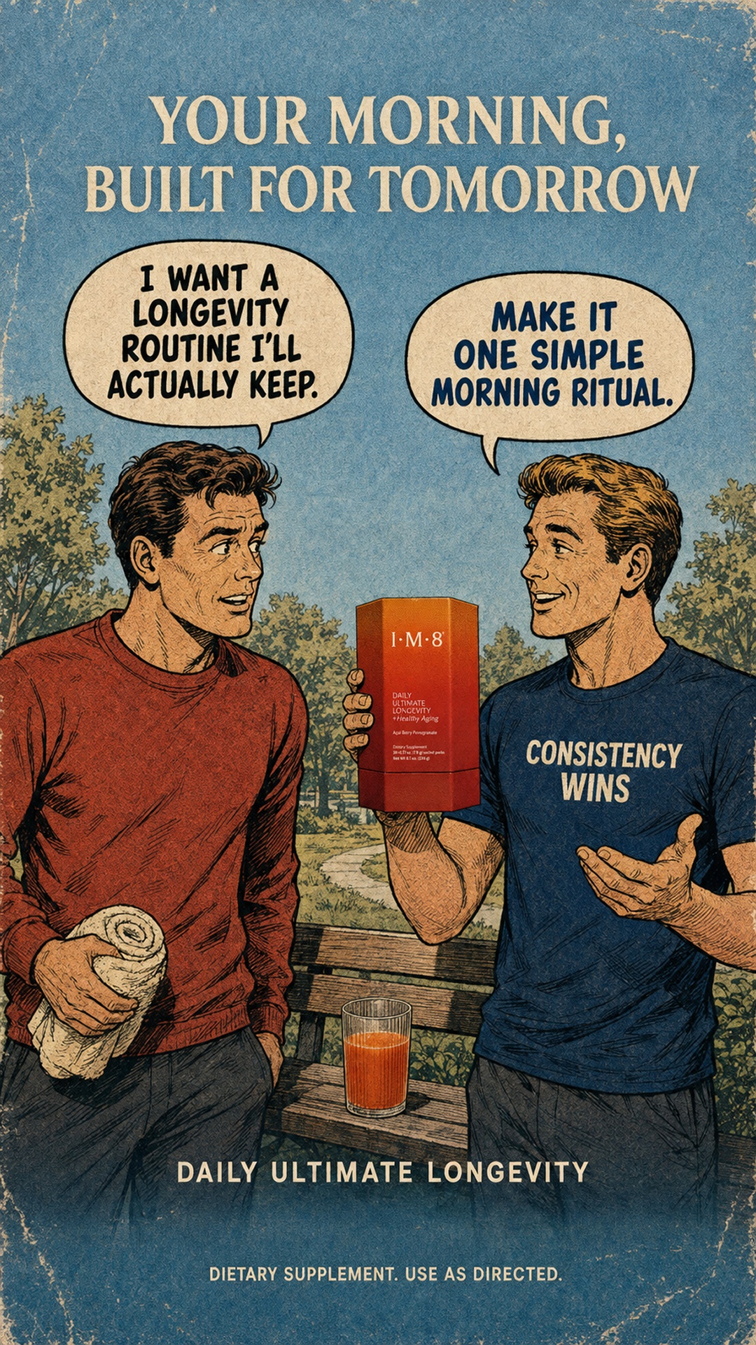
Pick one decade and commit to every element
Typeface, palette, illustration style, paper texture, even the phrasing of the copy. The format dies on mixed signals — a vintage illustration with a modern geometric sans in it reads as a template someone half-finished, not as an artefact. If one element can't be period-correct, change it or drop the archetype.
The product is the only modern thing in frame
Everything around it is aged; the pack shot stays clean, current and correctly rendered. That single anachronism is what makes the ad legible as an ad rather than a piece of found art, and it puts the product at the visual centre by contrast alone.
Wear the print, don't filter the image
Edge foxing, paper grain, slight misregistration in the inks, colour that's sunk rather than saturated. A sepia overlay on a modern render is the version everyone can spot instantly. The goal is an object that was printed and then sat somewhere for forty years.
Write the copy in the era's voice
Old advertising was declarative, wholesome and slightly earnest — short spoken lines, benefit stated plainly, no irony. Modern DR phrasing inside a vintage frame breaks the illusion faster than any visual mistake, because the reader hears it.
Let the era's own devices carry the message
Speech bubbles, before-and-after panels, starbursts, "as advertised" seals, slogan-bearing clothing. These are period-correct and functional — a speech bubble is the cleanest way to put a customer objection and your answer in the same frame, which is what most of these ads are actually doing.
Eras carry baggage — choose deliberately
Vintage advertising's visual language came with vintage advertising's assumptions, and recreating a 50s ad too faithfully can import gender roles and casting norms you didn't intend to sell. Keep the craft, update who's in the frame.
Period styling doesn't buy you period claims
Nostalgia makes bold health and results claims feel like charming old-timey puffery rather than assertions — reviewers and regulators read them as assertions. Supplements especially: the disclaimer still has to be there, and the claim still has to be one you can stand behind.
Reference 1
AI Edit Master Prompt
Using the attached image as the layout reference: keep the mid-century printed-poster treatment throughout — flat muted colour, visible paper grain, foxed and worn edges, hand-inked illustration with cross-hatched shading — over a soft sky-toned background. Keep a bold all-caps serif headline on two centred lines across the top, two oval speech balloons side by side beneath it with tails pointing down, two illustrated figures standing in an outdoor scene below facing each other in conversation, one holding the product up between them at chest height, a short slogan lettered across the right figure's shirt, a small everyday prop in the left figure's hand, a wooden surface at waist height in front of them carrying a filled glass, a centred all-caps product name near the bottom, and a small centred line of legal text at the very bottom edge. Replace the product with {YOUR PRODUCT}. Set the headline to "{THE PROMISE}", the left balloon to "{THE CUSTOMER'S DOUBT}", the right balloon to "{THE SIMPLE ANSWER}", the shirt slogan to "{YOUR PRINCIPLE}", the product name line to "{YOUR PRODUCT NAME}", and the footnote to "{YOUR DISCLAIMER}".