
Email Screenshot
- Format
- Static
- Category
- Native & UI Mimicry
- Stage
- TOF, MOF
- Requires
- A writer
What is it
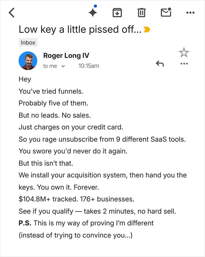
The ad presented as an email open on a phone: subject line, sender, timestamp, body text, and the native interface around it. It borrows the most personal screen people look at every day, so it reads as a message rather than a promotion. There are two main versions. In one, the brand writes directly to the viewer in a founder's voice. In the other, the email is the problem itself: a lost deal, a rejection, a bill. The viewer recognises the moment and the ad copy supplies the fix.
What makes it work
The subject line is the headline
It's the first thing read and it decides whether anyone reads further. Write it the way a real person would: lowercase energy, a trailing ellipsis, a bit of emotion. "Low key a little pissed off..." "RE: Quote - 14 Ashburton Rd." Anything that looks like a marketing subject line collapses the illusion instantly.
Short lines, fast rhythm
One thought per line, no paragraphs longer than two lines. On a phone screen that reads as a rapid sequence the eye falls down, which is what keeps people reading to the end. Walls of text get skipped no matter how good they are.
The native interface has to be complete and correct
Status bar, back arrow, action icons, folder label, avatar, "to me," timestamp, reply bar. Each missing or wrong element makes it look like a template. Use one real email client's layout and keep every element in place, but don't use a real provider's logo.
Founder voice: problem, failed alternatives, difference, proof, easy ask
The body follows a tight arc: name what they've already tried, why it didn't work, why this isn't that, one line of hard numbers, then a low-friction ask ("takes 2 minutes, no hard sell"). A P.S. line with a twist gets read more than anything else in the email, so use it.
Pain-moment version: show the email they dread
The rejection, the lost quote, the "we went with someone else." Leave the email itself unsold and polite, and put the solution in the ad's primary text or on a second card. The viewer's own reaction does the selling, because they've received that exact email.
Make the sender believable
A real founder photo or initials avatar, a real-sounding name, a plausible time. A stock-model headshot or a brand name as the sender makes it feel like marketing again.
Don't fake someone else's words
The brand writing as itself is fine. A pain-moment email that's clearly a relatable scenario is fine. An email styled as a real customer praising you, or a fabricated message from a real company, is a fabricated testimonial. Use real ones with permission, or keep the sender generic and the content clearly illustrative.
Reference 1
AI Edit Master Prompt
Using the attached image as the layout reference: keep the screenshot of a mobile email client on a white background — a top action row with a back chevron and a line of small monochrome icons, the subject line beneath it in large regular weight ending in a small coloured flag marker, a small grey folder label below that, then a sender row with a circular profile photo, the sender name in bold, a "to me" recipient dropdown and a timestamp, with a reply arrow, star and overflow dots aligned right. Below that keep the body in plain black sans-serif at reading size, left-aligned, broken into many very short one-line paragraphs with generous line spacing, and a final short paragraph opened by a bold two-letter prefix. Replace the profile photo with {YOUR SENDER PHOTO}. Set the subject to "{THE EMOTIONAL HOOK}", the sender to "{YOUR SENDER NAME}", the body to "{WHAT THEY'VE ALREADY TRIED} {WHY IT FAILED} {WHY THIS IS DIFFERENT} {THE PROOF NUMBERS} {THE LOW-FRICTION ASK}", and the closing paragraph to "{THE POSTSCRIPT TWIST}".Reference 2

AI Edit Master Prompt
Using the attached image as the layout reference: keep the screenshot of a default mobile mail app on a white background — a phone status bar at the top with carrier, signal, time and battery, a bold subject line in large black type beneath it, then a sender row with a grey circular initials avatar, the sender name in bold, a small grey "to me" link and a timestamp aligned right, and a thin divider. Below keep the body in plain black sans-serif at reading size, left-aligned, set as a short greeting line and three brief paragraphs separated by blank lines, with a polite sign-off, and along the bottom edge a light toolbar of five thin blue line icons. Set the subject to "{THE DREADED SUBJECT LINE}", the sender to "{A GENERIC CUSTOMER NAME}" with initials "{THEIR INITIALS}", the greeting to "{HI YOUR NAME}", the three paragraphs to "{THE POLITE OPENER}", "{THE BAD NEWS}" and "{THE SIGN-OFF}".