
Educational Infographic
- Format
- Static, Video
- Category
- Education / Problem Awareness
- Stage
- TOF, MOF
- Requires
- Information that's accurate on its own
What is it
An ad that teaches something before it sells anything: a grid of warning signs, a decision tree, a simple checklist, a "what's actually happening" breakdown. The viewer gets real value from the frame even if they never click, and that value is what earns the pitch at the bottom. It works because people save, screenshot and share useful content, and because recognising yourself in an explainer feels like a discovery rather than a sales moment.
What makes it work
The frame has to be worth reading without the product
Cover the CTA and the logo. If what's left is still useful, true and specific, the format works. If it's only a thin excuse for a pitch, readers sense it immediately and the "education" reads as manipulation.
Pick a structure that matches how people think about the problem
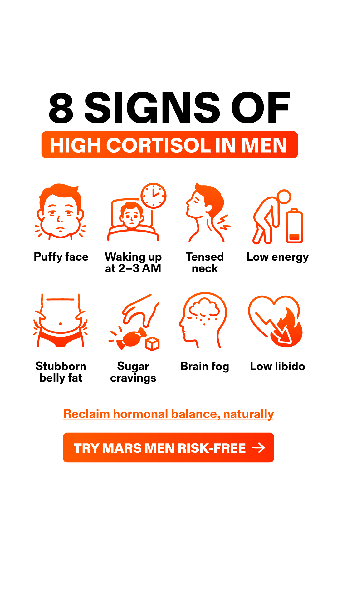
Signs grid: "Is this happening to you?" Best for problems people suspect but haven't named. Decision tree: "Yes / No" branches that route the reader to your product. Best for problems people have already tried to fix. Checklist: "Already tried all of these?" Best for disqualifying competitors without naming them. Mechanism explainer: "Here's why X happens." Best for products with a genuinely different approach.
Icons carry the scan, labels carry the meaning
In a grid, consistent line icons in one accent colour let the eye sweep all eight items in a second, and the two-to-three word labels do the rest. Mixed icon styles or long labels break the scan and turn it into reading.
Let the reader route themselves
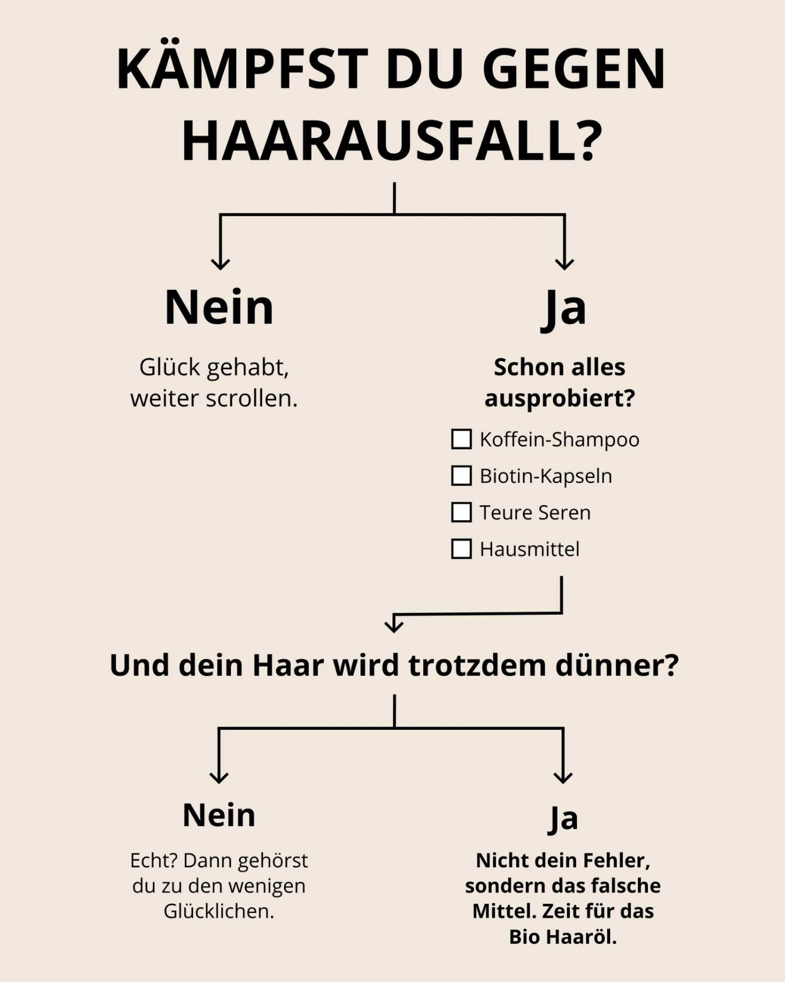
The decision tree is the strongest version because the viewer answers the questions. By the time they reach the product branch, they chose that path. Include a cheeky "No" branch ("Lucky you, keep scrolling") because it signals honesty and makes the "Yes" path feel self-selected.
Never let it read as a diagnosis
In health and wellness this is the line that matters most. "8 signs of X" works as awareness; it becomes a problem when it implies the viewer has a medical condition or that the product treats it. Meta's personal attributes policy also rejects copy that asserts the viewer's health state ("Are you losing your hair?", "your cortisol is high"), so frame around the topic, not the person: "Signs of…", "Common causes of…". The same logic applies to EU and German health claim rules (HCVO, HWG).
The CTA is a single calm step
One underlined line and one button, or one bolded final branch. After educating someone, a loud sales block feels like a bait-and-switch. The transition should feel like the natural next step in the lesson.
It works as motion
In video, signs appear one per beat, or the tree branches unfold as the viewer's answers are "chosen." The build gives you a ready-made script and holds attention through the reveal.
Reference 1
AI Edit Master Prompt
Using the attached image as the layout reference: keep the plain white background and a large heavy black all-caps sans-serif headline centred at the top, with its second half set in white inside a rounded solid bar in a bright warm gradient accent colour. Beneath it keep a four-by-two grid of simple single-colour line icons in the same accent gradient, each illustrating one sign in a friendly, clean pictogram style, with a short bold black label of one to three words centred beneath each icon. Below the grid keep a single underlined line of text in the accent colour, then a wide rounded gradient button with bold all-caps white text and an arrow, and generous empty white space above and below the whole block. Set the headline to "{THE NUMBER AND 'SIGNS OF'}" with the bar reading "{THE TOPIC}", the eight icons and labels to "{EIGHT COMMON SIGNS}", the underlined line to "{THE BENEFIT PROMISE}", and the button to "{THE CTA}".Reference 2
AI Edit Master Prompt
Using the attached image as the layout reference: keep the plain warm beige background and a black flowchart built only from type, thin black lines and simple arrowheads, with no imagery. At the top keep a large bold all-caps question on two centred lines, splitting into two branches with downward arrows: a left branch with a bold short answer and a one-line dismissive reply in regular weight beneath it, and a right branch with a bold short answer, a bold follow-up question, and a list of four empty checkbox items. From the checklist keep a line that routes back to centre into a second bold full-width question, which splits again into two branches: a left one with a bold answer and a short reply in regular weight, and a right one with a bold answer and a bold concluding paragraph that introduces the product. Set the top question to "{THE PROBLEM QUESTION}", the first left reply to "{THE KEEP-SCROLLING LINE}", the follow-up to "{THE ALREADY-TRIED QUESTION}", the checklist to "{FOUR THINGS THEY'VE TRIED}", the second question to "{THE STILL-HAPPENING QUESTION}", the second left reply to "{THE LUCKY-FEW LINE}", and the final paragraph to "{NOT YOUR FAULT, IT'S THE WRONG APPROACH} {YOUR PRODUCT}", keeping the branch answers as "{YES WORD}" and "{NO WORD}" in the ad's language.