
Don't Buy This
- Format
- Static, Video
- Category
- Reverse Psychology & Anti-Sell
- Stage
- TOF, MOF
- Requires
- A clear idea of who the product isn't for
What is it
The headline tells the viewer not to buy, and then lists the conditions under which that advice applies. Every condition turns out to describe the kind of product the buyer is trying to get away from. It reverses the most predictable sentence in advertising, which alone stops the scroll. It also flatters the reader: by ruling out the wrong customer, it quietly invites the right one to identify with everyone who wasn't ruled out.
What makes it work
The negation has to be the loudest thing in frame
"DON'T BUY" at maximum size, before the product name, before anything else. The jolt is entirely in reading an ad that seems to argue against itself, so it has to land before the eye has time to categorise the image as an ad.
The disqualifiers are really a competitor profile
"If you like loud, logo-heavy cases." "If you prefer mass-produced plastic." Each condition describes the alternative, never the viewer's own flaw. The reader should nod along thinking "no, that's not me," which is exactly the moment they've sold themselves.
Three conditions, parallel and short
Same grammatical shape, similar length, numbered or stacked. Three gives rhythm and still reads in a glance. One feels like a gimmick, five becomes a feature list in disguise.
Or hold it all back with "IF..."
The alternative structure puts no conditions in the frame at all, just the headline and a single "IF..." pill, and makes the viewer tap, swipe or watch to find out. Stronger for carousels and video, where the reveal can happen on the next card or beat. Weaker as a single static, because the loop never closes in-frame.
The product has to look like the opposite of the disqualifiers
If the conditions say "mass-produced," the product shot has to look crafted: texture, patina, monogram, hand in frame, natural light. The image is the proof that you're not the thing being warned against.
Close with a real CTA, not more irony
After the reversal, the button and the one-line spec summary are straight: "Upgrade your carry." "Full-grain leather. Solid-brass buttons." Staying ironic all the way down leaves the viewer unsure whether you want them to buy.
It works as motion
In video, the "Don't buy this" line lands first, the conditions appear one per beat, and the product and CTA arrive last. The format gives you a natural three-to-five beat script.
Reference 1
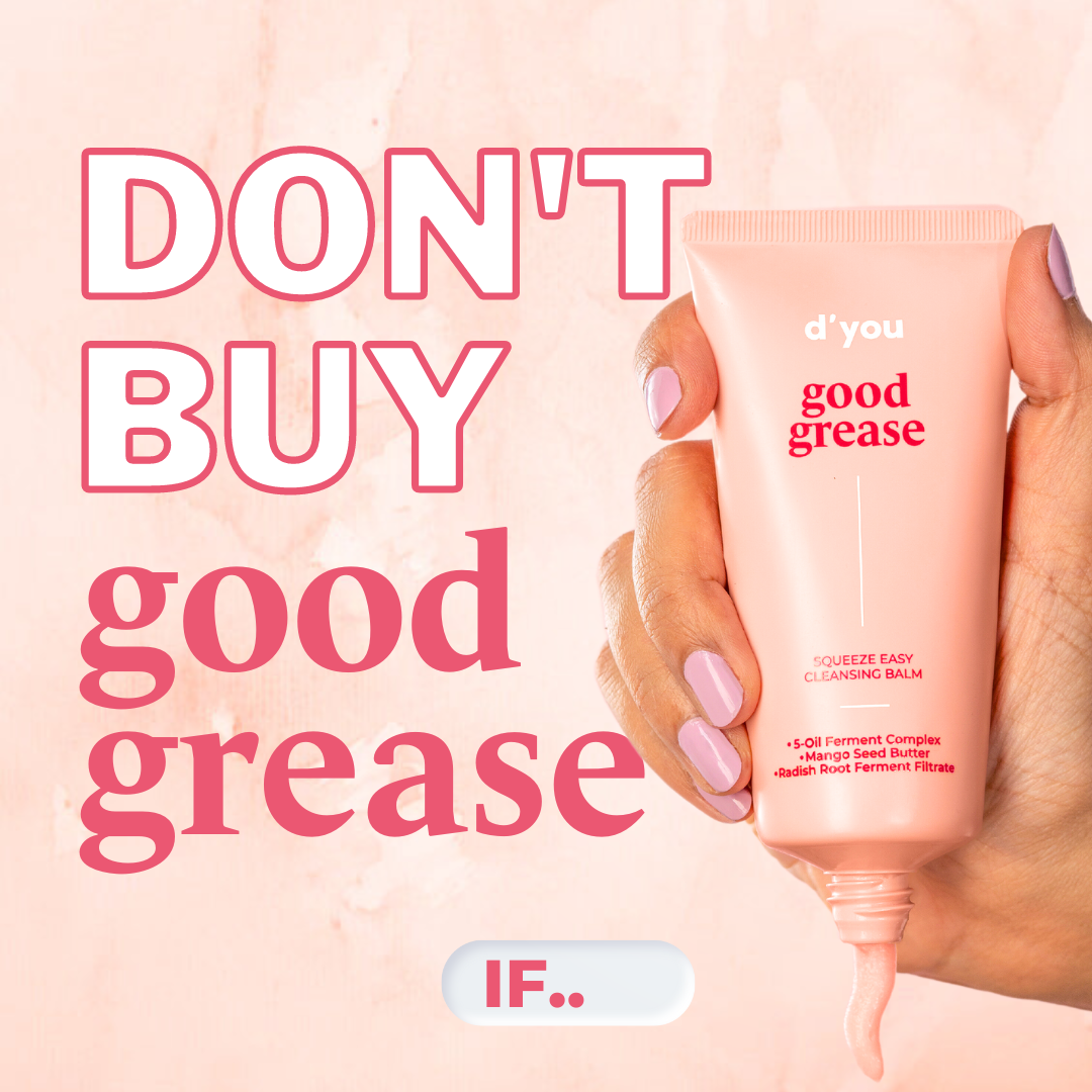
AI Edit Master Prompt
Using the attached image as the layout reference: keep the soft pastel textured wall background with a faint mottled plaster finish, a real hand entering from the right edge and gripping the product upright with a small ribbon of its contents squeezing out of the bottom, and on the left a stacked headline filling most of the height: two lines of very heavy all-caps sans-serif in white with a thick coloured outline, then two lines of large lowercase serif in the same solid colour. Centred near the bottom edge keep a small rounded white pill-shaped button with a soft 3D bevel holding a short bold word in the headline colour followed by two dots. Replace the product with {YOUR PRODUCT}. Set the outlined lines to "{THE NEGATION}", the serif lines to "{YOUR PRODUCT NAME}", and the pill to "{THE TEASER WORD}".Reference 2
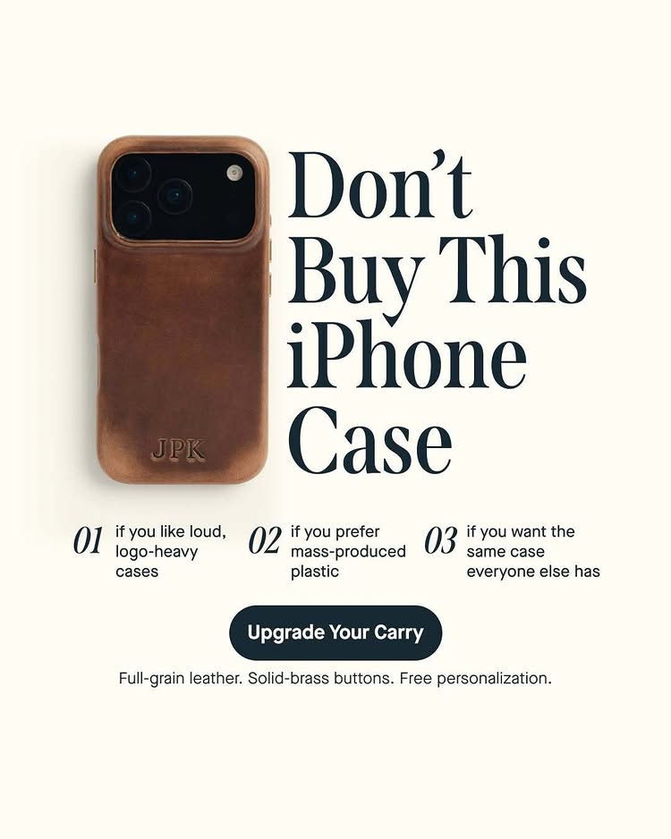
AI Edit Master Prompt
Using the attached image as the layout reference: keep the flat warm off-white background, the product photographed flat from above on the left with a soft natural shadow, and on the right a large dark serif headline on four left-aligned lines stacked tightly beside it. Below that keep a row of three short columns side by side, each opened by a large italic serif numeral followed by a small regular-weight sans-serif condition on two or three lines, then a centred dark rounded pill button with bold white text, and beneath it a single small line of product specs in regular weight. Replace the product with {YOUR PRODUCT}. Set the headline to "{DON'T BUY THIS} {YOUR PRODUCT CATEGORY}", the three columns to "{THREE DISQUALIFYING CONDITIONS}", the button to "{THE CTA}", and the specs line to "{THREE PROOF POINTS}".Reference 3
AI Edit Master Prompt
Produce a 21s vertical 9:16 POV ad for Oats Overnight. No dialogue. Generate the following sequence: The Introduction: First-person POV shot showing a prepared, drinkable oatmeal shake. The Preparation: Quick jump cuts of warehouse and lab staff highlighting product benefits like 20 grams of protein, high-quality ingredients, free shipping, and over 30 flavors. The Final Look: A steady shot of the Oats Overnight box traveling down the production line. Assemble: Fast-paced jump cuts. Focus on the scale of the facility and the staff to establish brand authority. Text Overlay: Static "DON'T BUY THIS DRINKABLE OATMEAL SHAKE" banner at the top of the screen throughout. Audio: Upbeat, trendy instrumental beat driving the cuts. No voiceover. End Card: Concludes naturally on the final shot of the product on the conveyor belt.
Reference 4
AI Edit Master Prompt
Produce a 23s vertical 9:16 POV ad for Stationery Pal pencil cases. No dialogue. Generate the following sequence: The Introduction: First-person POV shot showing pink pencil cases on a desk. The Demonstration: Quick jump cuts opening large-capacity and book-holder cases, followed by pressing a non-fall suction pencil case onto the desk and filling it with pens. The Final Look: A steady shot of the standing suction case holding stationery while simultaneously being used as a phone stand. Assemble: Fast-paced jump cuts. Focus on the tactile opening process and the multifunctional utility of the cases. Text Overlay: Static "Don't buy these pencil cases!!!" banner at the top of the screen throughout. Audio: Upbeat, trendy instrumental beat driving the cuts. No voiceover. End Card: Concludes naturally on the final lifestyle shot of the case functioning as a phone stand.
Reference 5
AI Edit Master Prompt
Produce a 12s vertical 9:16 POV ad for BondiBoost Thickening Therapy. No dialogue. Generate the following sequence: The Introduction: First-person POV shot holding the BondiBoost shampoo and conditioner bottles in a wet shower. The Application: Quick jump cuts of the product being pumped into a hand and lathered generously into wet hair. The Final Look: A steady shot of a woman confidently showing off her instantly plumped, thickened, and styled blonde hair while holding the products. Assemble: Fast-paced jump cuts. Focus on the tactile lathering process and the dramatic visual transformation of the hair volume. Text Overlay: Static "Don't use this shampoo + conditioner" banner at the top of the screen throughout. Audio: Upbeat, trendy instrumental beat driving the cuts. No voiceover. End Card: Concludes naturally on the final lifestyle shot of the model holding the thickening duo.